Your AI just wrote a 2,000-word blog post in ninety seconds. It's sharp. It's on-topic. And it's a solid wall of gray text with not one diagram, chart, or image in it. That's the trap nobody warns you about when you publish with AI. The words come free. The visuals don't come at all.
Here's the fix, and it's simpler than you think. You can add diagrams and charts to blog posts from the same AI chat that wrote the draft. No Canva. No screenshots. No image hosting. (For the one-off cases where you do want a raw image — an OG card, a code snippet as a picture — there's an image generator, a code-to-image tool and a markdown-to-image tool.) Your AI writes a small block of code, and it renders into a clean, branded image on your own domain.
To add diagrams and charts to blog posts without design tools, write the visual as code. Use a Mermaid block for a process, a Chart.js block for data, or HTML for a custom layout. A platform like Quillly renders that code into a hosted image when you publish, so your AI makes the visual in the same step it writes the words.
This matters more in 2026 than it did even a year ago. Visuals are no longer decoration. They are a ranking signal, a citation magnet, and often the difference between a post that gets read and one that gets bounced. Let's break down why, then walk the exact workflow.
Why AI-written blogs have no visuals#
The answer is simple: text is what large language models produce. Ask Claude, ChatGPT, or Cursor for a post and you get paragraphs. Ask for an image and you get a link to a separate tool, or an AI-generated picture that has nothing to do with your data.
So most people ship the wall of text. Or they stop, open a design app, build a chart by hand, export it, upload it, and paste it back in. That friction is why so many AI blogs look the same: hero photo at the top, then 2,000 words of nothing.
The gap isn't creativity. It's plumbing. The AI can describe a five-step process perfectly. It just can't get that process onto the page as a picture without a bridge between "code it can write" and "image your site can host."
That bridge is what changed.
Do images actually help SEO?#
Short answer: yes, and the numbers are not close. Visuals move both rankings and engagement, and the effect has grown every year.
97% of top-ranking Google pages include at least one image. A text-only page is competing against a field that is almost entirely illustrated (Amra & Elma).
Content with visuals gets 94% more total views than text-only content, up from 78% in 2020 (Zebracat).
Combining text and visuals boosts information retention by up to 65%. Readers remember your point, which is what turns a visit into a return visit.
Articles with an image every 75 to 100 words earn double the social shares of image-light posts. Placement and density matter, not just a single hero image.
Google Images drives 22% of all web searches, and Google Lens queries grow about 30% a year. That's search traffic most text-only blogs never touch (Amra & Elma).
Here's the same story in one chart.

None of this means you should stuff a post with clip art. It means the visuals have to carry information. Which brings us to the part most guides get wrong.
Visuals and AI citations: what ChatGPT and AI Overviews pull#
Ranking in blue links is only half the game now. The other half is getting cited inside AI answers, and visuals play a bigger role there than people expect.
Google AI Overviews now appear on 48% of searches, and brands cited in them earn 35% more clicks (Lumar). Those overviews pull from 5 to 8 sources and routinely surface images, charts, and multimedia alongside the text. If your post is the one with a clean chart answering the exact question, you're a natural pick. Here's the full method for ranking in Google AI Overviews and getting cited by ChatGPT.
The unsettling part: the overlap between top Google links and AI-cited sources has fallen from around 70% to below 20%. Page-one ranking no longer guarantees AI visibility. You have to earn the citation separately, and structured, information-carrying visuals are one of the levers.
As Aleyda Solis, founder of the SEO consultancy Orainti, puts it: "To rank in AI search, your content needs to sound like something AI would quote." The same logic applies to your visuals. A decorative stock photo is not quotable. A labeled chart of real numbers is. If you want the deeper mechanics, the 2026 AEO playbook for getting cited by ChatGPT and AI Overviews goes section by section.
The contrarian truth: stock photos won't save your post#
Conventional blogging wisdom says "add a hero image and you're done." That advice is now wrong, and following it wastes the single biggest on-page opportunity you have.
A generic Unsplash photo of a laptop tells Google nothing about your content. It carries no data, answers no question, and gives no AI engine a reason to cite you. It looks nice. That's the whole contribution.
What actually moves rankings and citations is original, information-carrying visuals: diagrams that explain a process, charts that show your numbers, tables that compare options, callouts that summarize a takeaway. Kevin Indig's research on LLM visibility keeps landing on the same theme. Brands earn AI citations through structured data and original first-party assets, not decoration.
So the goal isn't "more images." It's more images that mean something. And the fastest way to produce those at scale is to stop drawing them and start writing them as code.
The Code-to-Canvas Method#
Here's the framework. The Code-to-Canvas Method means you never leave your AI chat to make a visual. You describe what you want, your AI writes the visual as a code block, and your publishing platform renders that code into a hosted image at publish time.
The flow looks like this.
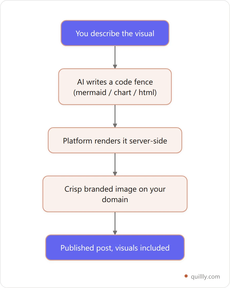
Four things make this work better than the old copy-paste-from-Canva routine:
Same context. The AI already knows your data and your point, so the chart is right the first time.
Editable forever. The visual is text. Change a number, re-render, done. No hunting for the source file.
On your domain. The image is hosted where the post lives, so it counts as your asset, not a third party's.
Consistent branding. Rendered visuals inherit your site's theme colors instead of clashing. If you're picking those theme colors in the first place, a color picker and a palette generator will get you a set that holds up in both light and dark mode.
In Quillly, this is a code fence inside the blog body. When you call create_content, a fenced block like image:mermaid renders server-side into a crisp image. You get the visual without ever touching a design tool.
The Fence Rule: which visual for which job#
Picking the visual type is the part people overthink. Use the Fence Rule: match the fence to what you're showing. It takes the guesswork out.
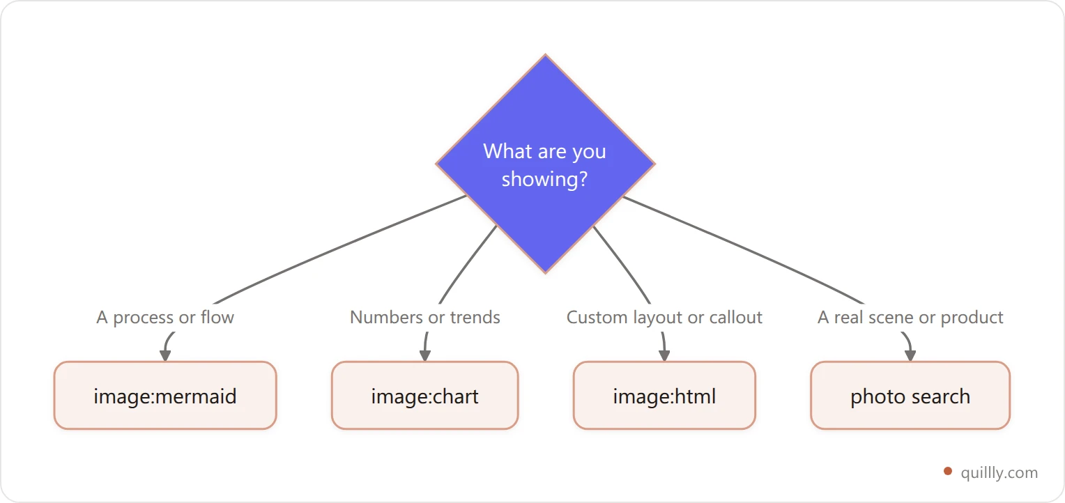
Here's the same rule as a reference table.
Fence | Best for | Example | You write |
|---|---|---|---|
| Processes, flows, decision trees, timelines | A 4-step onboarding flow | Mermaid text |
| Data, trends, comparisons, share-of | Traffic before vs after | Chart.js JSON |
| Custom callouts, stat cards, layouts | A "key takeaway" card | HTML + theme vars |
| Precise custom graphics | A branded badge | Raw SVG |
Photo search | Real scenes, products, people | A hero image | A search query |
Mermaid is the workhorse. It reads like Markdown, and it has become the default for diagram-as-code: over 80,000 weekly npm downloads and use in roughly 30% of technical documentation projects (GitHub). If your AI can write Markdown, it can write Mermaid.
How to add diagrams and charts to blog posts from your AI#
Let's get concrete. Say you're writing a post and you hit a section that describes a three-stage process. Instead of leaving it as prose, you prompt your AI.
A prompt that works:
"Add a Mermaid flowchart showing the three stages: draft, review, publish. Keep labels short."
Your AI writes a fenced code block that opens with image:mermaid, and you drop it straight into the body. In your editor it's wrapped in triple backticks:
image:mermaid alt="Three-stage flow: draft, review, publish"
flowchart LR
  A[Draft] --> B[Review] --> C[Publish]
For data, ask for a chart and hand it your numbers:
"Turn these into a bar chart: organic clicks were 120 in May, 340 in June, 610 in July."
You get a Chart.js block:
image:chart alt="Organic clicks by month"
{
  "type": "bar",
  "data": {
    "labels": ["May", "June", "July"],
    "datasets": [{ "label": "Organic clicks", "data": [120, 340, 610] }]
  }
}
For a custom callout, ask for an HTML card that uses your theme colors:
image:html alt="Key takeaway card"
<div style="padding:40px;background:var(--surface);color:var(--ink)">
  <h3 style="color:var(--brand)">Key takeaway</h3>
  <p>Write visuals as code. Render them at publish.</p>
</div>
That's the whole loop. Prompt, paste the fence, publish. The same pattern works whether you drive it from Claude Desktop, Cursor, or ChatGPT over MCP. The AI writes the code, and the platform turns it into a picture.
Start to finish: from prompt to published visual#
Here's how it feels to add diagrams and charts to blog posts this way in practice. You're writing in Claude, Cursor, or ChatGPT with Quillly connected. You finish a section on your publishing workflow and realize it's begging for a picture.
You type one line: "Add a Mermaid flowchart of these four steps." The model writes the fence. You paste it into the draft. That's the diagram done.
Two paragraphs later you mention some traffic numbers. "Chart these as a bar graph." Another fence, another visual, still no design tool open. By the time the draft is finished, the post already has its charts in blog posts and its process diagrams baked in, spread across the sections.
Then you publish. The create_content call renders every fence into a hosted image, and check_blog_seo confirms your visual density is in range. Total design tools opened: zero. Total context switches: zero.
That's the real unlock. The bottleneck was never ideas for visuals. It was the ten-minute detour to build each one. Writing them as code deletes the detour, so blog post images stop being the thing you skip when you're busy.
How visual density factors into your SEO score#
This is where the payoff shows up in a number you can watch. Modern blog SEO scoring doesn't just count words. It checks whether you have enough visuals and whether they're spread out.
Use the 1-per-400 rule as your floor.
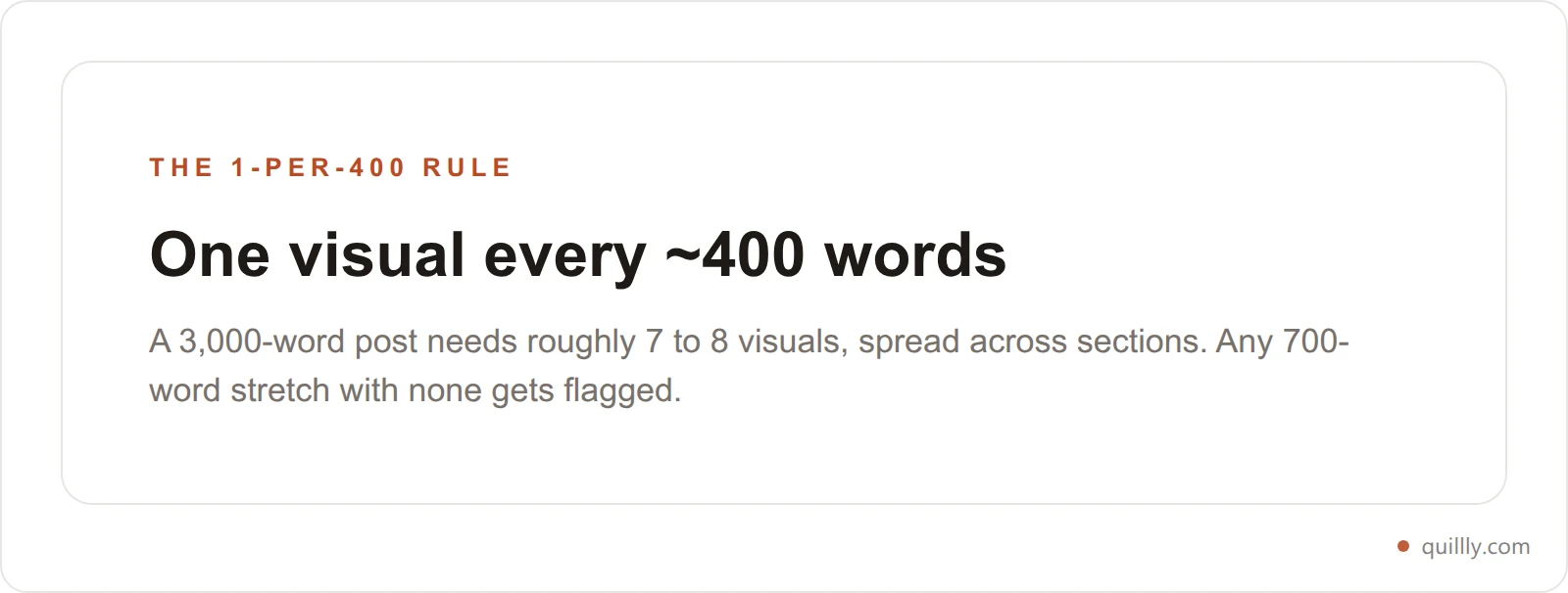
Quillly's SEO score checks exactly this: a visual roughly every 300 to 500 words, distributed across the post, not clustered at the top. A long stretch with no visual drags the score down. Add code-rendered diagrams and charts, and it climbs. If you want the full breakdown of what the score measures, see how the blog SEO score is actually calculated.
Here's a representative before-and-after. A typical AI-drafted post lands around 71 with zero visuals. Add one visual per 400 words and the same post crosses 90.

Density isn't a ceiling. It's a floor. Wherever a concept is complex enough that a picture explains it faster than a paragraph, add one. Extra visuals are never penalized.
Common mistakes that undo the benefit#
Adding visuals the wrong way can cost you the gains. Watch for these.
Skipping alt text. Every fence takes an
altattribute. It's how screen readers and AI crawlers understand the image. No alt, no credit. Write a real description, not "chart1."Decorative-only images. A photo that carries no information is filler. Aim for visuals that answer a question or show data.
Front-loading them all. Three charts at the top and nothing after is worse than one every few hundred words. Spread them out.
Charts that mix units. Don't jam "94% more views" and "48% of searches" into one bar chart. Keep each chart to one coherent series.
Forgetting the numbers matter more than the picture. A clean chart of real, sourced data is what earns backlinks and citations. Track which visuals actually drive engagement on your posts and lean into those.
Get these right and your visuals do double duty: better for humans reading, better for machines citing.
Frequently asked questions#
How do I add a diagram to a blog post without a design tool?#
Write the diagram as code instead of drawing it. A Mermaid code block describes a flowchart or process in plain text, and a publishing platform like Quillly renders it into a hosted image when you publish. Your AI can generate the Mermaid code in the same chat that wrote your draft, so you never open a separate design app.
What's the best way to add charts to blog posts?#
Use a Chart.js code block. You give your AI the numbers, it writes the chart definition as JSON, and the platform renders it into an image on your domain. This beats screenshotting a spreadsheet because the chart stays editable, matches your site's colors, and is hosted where your post lives rather than on a third-party service.
Do images really affect blog SEO in 2026?#
Yes. 97% of top-ranking Google pages include at least one image, and content with visuals earns 94% more views than text-only content. Modern SEO scoring also checks visual density, expecting roughly one visual every 300 to 500 words. Posts that are pure text are competing at a structural disadvantage against illustrated rivals.
Can AI write Mermaid diagrams and charts for me?#
Yes, and reliably. Mermaid and Chart.js are text-based formats, so any capable model like Claude, ChatGPT, or Gemini can generate them from a plain-English prompt. Because they're code, the AI can also revise them instantly when you change a number or a step, without regenerating an image file.
How many visuals should a blog post have?#
Follow the 1-per-400 rule: about one visual for every 400 words, spread evenly. A 3,000-word post lands around 7 to 8 visuals. Avoid clustering them at the top. Any long stretch with no visual reads as a wall of text to both people and SEO scoring tools, and pulls your score down.
Will diagrams and charts help me get cited by ChatGPT and AI Overviews?#
They help. AI Overviews appear on 48% of searches and frequently surface charts and multimedia from the sources they cite. Original, information-carrying visuals give AI engines a concrete, quotable asset. Decorative stock photos do not. Pair structured visuals with clear, sourced data and you improve your odds of being the cited source.
Do rendered visuals slow down my page?#
Not meaningfully when they're rendered to optimized image files. Code fences that render to a compressed image (like WebP) at publish time serve as a single lightweight file, unlike live JavaScript charts that run in the browser. That keeps your page fast while still giving crawlers a clean, static image to read. For the full picture on speed, see how to fix a slow blog's Core Web Vitals.
The takeaway#
Visuals stopped being optional. Content with them earns 94% more views, 97% of top-ranking pages include at least one image, and AI Overviews cite the sources that bring charts and data to the answer. The blogs that stay pure text are quietly losing on all three fronts.
The move is to make visuals as cheap to produce as the words. Write them as code. Use Mermaid for process, Chart.js for data, HTML for layout, and follow the 1-per-400 rule so they're spread across the whole post. Your AI can produce every one of them in the same conversation that wrote your draft.
That's the Code-to-Canvas Method in one line: your AI writes the visual, your platform renders it, your domain hosts it.
Want your AI to write the diagram and publish the post it just drafted? Connect Quillly to Claude, Cursor, or ChatGPT in 30 seconds.